Managing Daily Processes
The
button on the main Operations page takes you to a page where you can
view and manage the Daily processes in operation.
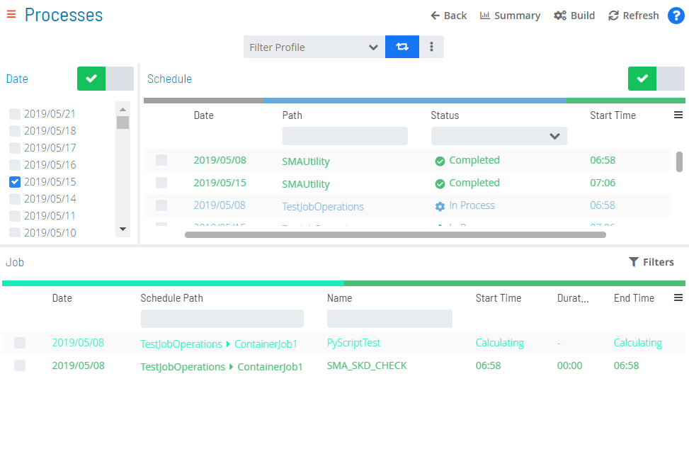
Daily Processes Page

There are several options on this page that you can use to help enrich your user experience. These next subsections describe these options in detail.
Toolbar Options
This Daily Processes page has the following toolbar options for navigation or data refresh:
- Back: This button takes you back to the previous view or page that was accessed.
- Summary: This button takes you to the main Operations page.
- Refresh: This button refreshes the data on the Processes page so that it is up-to-date.
Date/Schedule Selection Enabling/Disabling
The Date and Schedule toggle switches are provided for enabling or disabling date and schedule selections, respectively. The switch will appear with a green checkmark when enabled. When disabled, the switch will appear with a gray circle.
Filter Profiles
Filter profiles are user-defined filters in the Operations Processes view that can be used persistently and shared with others.
Filter Profile Bar
Creating and Sharing Filter Profiles
To create a filter profile:
Set the desired filter(s) in the Operations Processes view.
Keep in mind that any changes that you make to affect the column state of the grids (e.g., hiding columns) will not be stored by the filter profile.
Click the Advanced button ()
on the filter profile bar to expose the action buttons.
Click the Add button ().
Enter a name for current set of filters.
Use the Share with drop-down list to set the share status of the filter profile. The share detail will appear in parentheses next to the name (e.g., Test Filter (Private) or Test Filter (Role_ocadm)).
- Select a specific role to grant anyone assigned to that particular role access to it and the ability to update it.
- Set the filter profile to Public to grant everyone access to it. Only those in the ocadm (or equivalent) role will have the ability to update it.
- Set the filter profile to Private if you do not wish to share it with others. Only the current user will have access to it and the ability to update it.
Click the Save button ()
to save the new filter profile.
Personal (private), public, or shared (those shared to and shared with) filter profiles are accessible from the Filter Profile drop-down list on the filter profile bar.
Modifying Filter Profiles
Any current user, assigned role, or role with adequate permission (e.g., ocadm) may modify a filter profile.
To modify a filter profile:
- Select an existing filter profile from the Filter Profile drop-down list.
- Modify the existing set of filters.
- Click the Advanced button (
) on the filter profile bar to expose the action buttons.
- Click the Save button (
) to save the updates.
You could also use an existing filter profile as a base, modify it, and save it as a new filter profile. To do so, you would select the existing profile, modify the existing set of filters, click the Add button (), enter a new name, configure sharing, and save it has a new filter profile.
Deleting Filter Profiles
To delete a filter profile:
- Select an existing filter profile from the Filter Profile drop-down list.
- Click the Advanced button (
) on the filter profile bar to expose the action buttons.
- Click the Delete button (
) to delete the filter profile.
Accessing Filter Profiles via Direct URL
Filter profiles can also be accessed via direct URLs that are obtained from the Operations Processes page.
To get the direct URL:
- Select an existing filter profile from the Filter Profile drop-down list.
- Click the Advanced button (
) on the filter profile bar to expose the action buttons.
- Click the Link button (
). A Filter Profile Link dialog (similar to the graphic) should display.
Filtering
Filtering is available for the Schedules, Jobs, and Agents grids (lists). Using this feature makes it easier to target particular items, especially when a large number of items are returned.
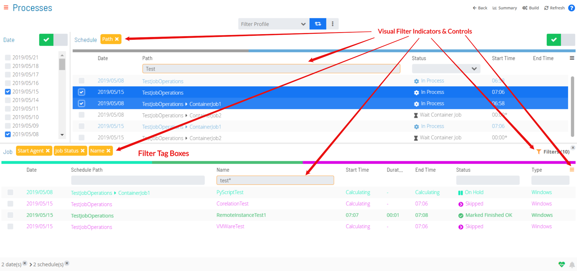
Keep in mind the following visual indicators on the page when filtering is applied:
- The color scheme of dark yellow serves as a visual identifier of "filtered" and will be applied to field borders, buttons, controls, tags, etc.
- The triple bar button on top-right corner of grids (
) changes to dark yellow whenever a hidden column has filter criteria.
- A filter tag box, which represents the field name that has been filtered, will appear on a tag bar above the grid. Clicking on the x at the top-right corner of filter tag box removes the active filter.
Visual Filter Indicators in Operations

Quick Filtering
For quick filtering, use the Filter Bar just above the grid to filter the list. Type the keyword in the appropriate field and click Enter, and the list will filter accordingly. This option is available for the Schedules, Jobs, and Agents grids.
Quick Filtering
The Schedules filter bar also has a Status drop-down list which has the following options: Waiting, Held, In Progress, Completed, and Completed with Error(s). You can filter the list to display only those schedules that fall under the category of the selected status.
In-depth Filtering
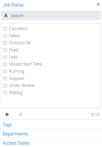
For more in-depth filtering in the Jobs grid, you can use the
button to display a Filter panel where you can filter the list of
jobs by job status, tag, department, or access code. Use the
button to select all or the
button to deselect all available options in each of the according-style
tabs in the panel. The panel will also display the number of filters
turned on per tab.
Filter Panel

The filter button icon in the grid will change to dark yellow and also
display the number of filters currently turned on ().
Click on the x at the top-right corner of the button to remove all
selected filters at once. Any applied filter will also appear as a dark
yellow filter tag box on the tag bar above the grid.
Interactive Filtering
For interactive filtering, use the color-coded Statistics Bar above the grid to filter the list by the current status. Each color represents a status. Click on any color in the bar to filter the list view by that particular status. This option is available for the Schedules, Jobs, and Agent grids.
Interactive Filtering
A filter tag box (),
indicating which field name has been applied, will appear on the tag bar
above the grid and the border of the Status field on the filter bar
will change to dark yellow while the field itself will be populated with
the status by which the grid has been filtered.
Column Sorting and Display
Column sorting and display is available for the Schedules, Jobs, and Agents grids.
- For sorting, click on the column heading to sort the column in ascending order (indicated by a small arrow pointing down). Click on the column heading again to sort the column in descending order (indicated by a small arrow pointing up).
- For display, use the triple bar button (
) to select which columns are displayed.
Right-Click Action
You can right-click on any item in the list to display its Selection panel where actions can be performed based on current selection(s). This functionality works in the Schedules, Jobs, and Agents grids.
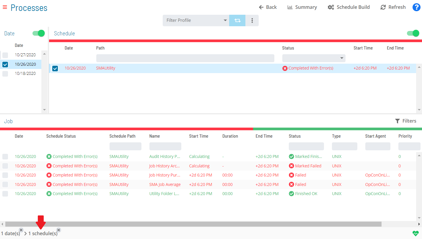
Breadcrumb Selection
Whenever a selection is made in the Date, Schedule, Job, or Agents list, a record of that selection is displayed in the Status Bar at the bottom of the page. This record takes the form of a breadcrumb trail. As with the right-click functionality, you can click on the record (currently not available for date records) to display a Status Update panel where you can perform actions based on current selection(s).
Breadcrumb Selection

Related Topics