Managing Daily Processes
Theme: Configure
Who Is It For? System Administrator, Automation Engineer
What Is It?
The
button on the main Operations page takes you to a page where you can
view and manage the Daily processes in operation.
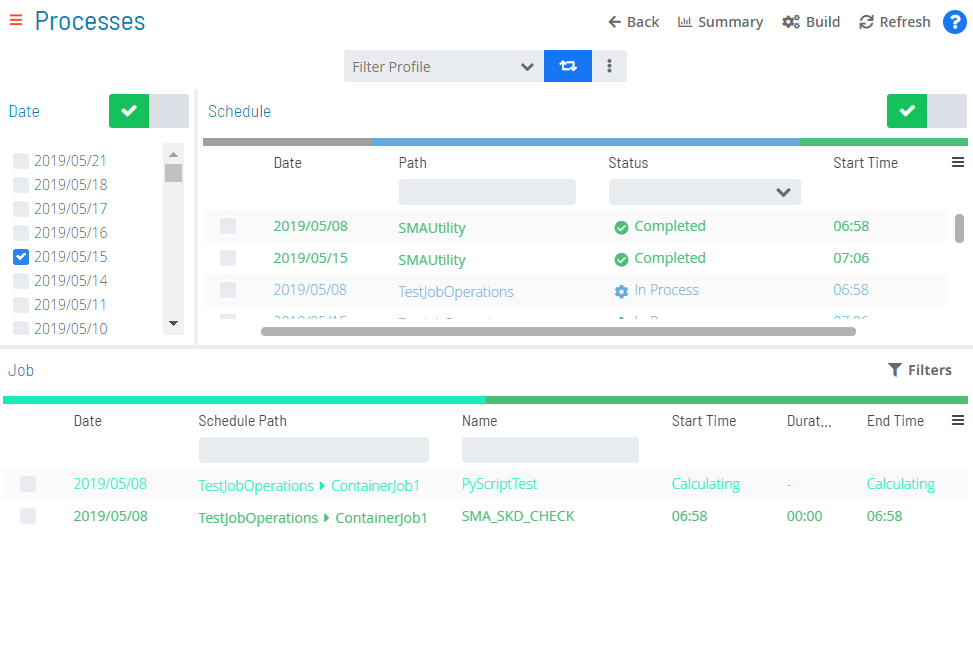
Daily Processes Page

Toolbar Options
The Daily Processes page has the following toolbar options:
- Back: Returns to the previous view or page
- Summary: Returns to the main Operations page
- Refresh: Refreshes data on the Processes page
Date/Schedule Selection Enabling/Disabling
The Date and Schedule toggle switches enable or disable date and schedule selections. A green checkmark indicates enabled; a gray circle indicates disabled.
Filter Profiles
Filter profiles are user-defined filters in the Operations Processes view that can be saved persistently and shared with others.
Filter Profile Bar
Creating and Sharing Filter Profiles
To create a filter profile:
- Set the desired filter(s) in the Operations Processes view
Changes that affect column state (e.g., hiding columns) are not stored by the filter profile.
To filter Profiles, complete the following steps:
-
Select the Advanced button (
) to expose the action buttons
-
Select the Add button (
)
-
Enter a name for the filter set
-
Use the Share with list to set the share status. The share detail appears in parentheses next to the name (e.g., Test Filter (Private) or Test Filter (Role_ocadm)):
- Select a specific role to grant anyone in that role access and the ability to update it
- Select Public to grant everyone access. Only those in the ocadm (or equivalent) role can update it
- Select Private to restrict access to the current user only
-
Select the Save button (
)
Private, public, and shared filter profiles are accessible from the Filter Profile list on the filter profile bar.
Modifying Filter Profiles
To modify a filter profile:
- Select an existing filter profile from the Filter Profile list
- Modify the existing set of filters
- Select the Advanced button (
)
- Select the Save button (
)
To save a modified profile as a new profile, select the existing profile, modify the filters, select Add, enter a new name, configure sharing, and save.
Deleting Filter Profiles
To delete a filter profile:
- Select an existing filter profile from the Filter Profile list
- Select the Advanced button (
)
- Select the Delete button (
)
Accessing Filter Profiles via Direct URL
To get a direct URL for a filter profile:
- Select an existing filter profile from the Filter Profile list
- Select the Advanced button (
)
- Select the Link button (
). A Filter Profile Link dialog displays
Filtering
Filtering is available for the Schedules, Jobs, and Agents grids, making it easier to target specific items when many results are returned.
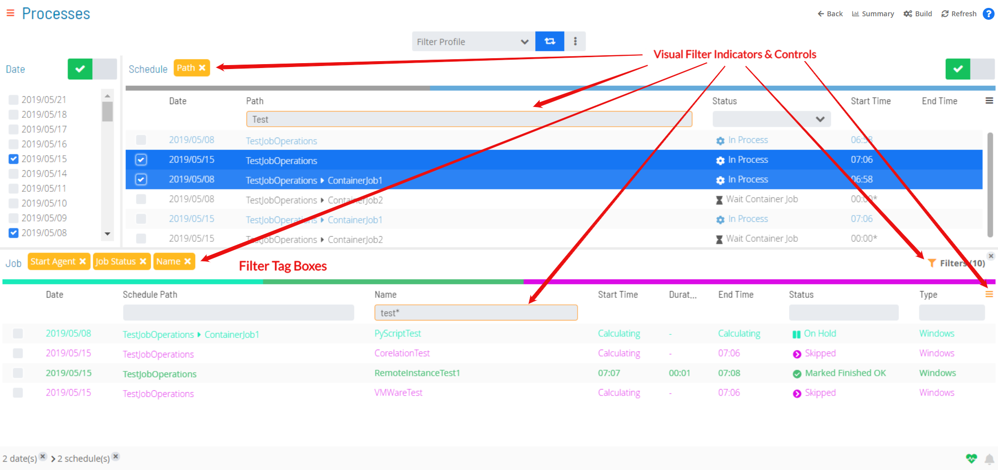
When filtering is applied, the following visual indicators appear:
- Dark yellow is applied to field borders, buttons, controls, and tags to indicate an active filter
- The triple bar button in the top-right corner of grids (
) turns dark yellow when a hidden column has filter criteria
- A filter tag box showing the filtered field name appears on the tag bar above the grid. Select the x on the tag box to remove that filter
Visual Filter Indicators in Operations

Quick Filtering
Use the Filter Bar above the grid to filter by keyword. Enter a keyword in the appropriate field and press Enter. Available for the Schedules, Jobs, and Agents grids.
Quick Filtering
The Schedules filter bar includes a Status list with the following options: Waiting, Held, In Progress, Completed, and Completed with Error(s).
In-depth Filtering
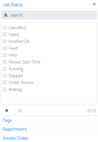
For more detailed filtering in the Jobs grid, select the
button to open a Filter panel. Filter by job status, tag, department, or access code. Use the
button to select all or the
button to deselect all options. The panel displays the number of active filters per tab.
Filter Panel

The filter button changes to dark yellow and shows the number of active filters (). Select the x on the button to remove all filters at once.
Interactive Filtering
Use the color-coded Statistics Bar above the grid to filter by current status. Each color represents a status. Select any color to filter the list by that status. Available for the Schedules, Jobs, and Agent grids.
Interactive Filtering
A filter tag box () appears on the tag bar above the grid, and the Status field border changes to dark yellow and shows the active status filter.
Column Sorting and Display
Column sorting and display is available for the Schedules, Jobs, and Agents grids.
- Sorting: Select a column heading to sort ascending (arrow pointing down). Select again to sort descending (arrow pointing up)
- Display: Use the triple bar button (
) to select which columns are displayed
Right-click Action
Right-click any item in the Schedules, Jobs, or Agents grids to display a Selection panel where you can perform actions on the current selection(s).
Breadcrumb Selection
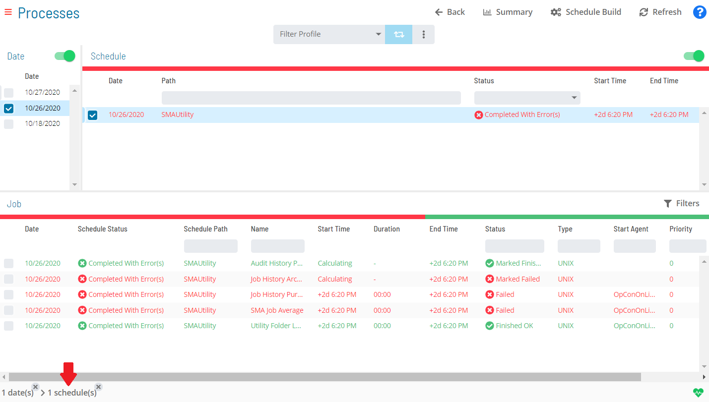
When a selection is made in the Date, Schedule, Job, or Agents list, it appears in the Status Bar at the bottom of the page as a breadcrumb trail. Select the record (not available for date records) to display a Status Update panel and perform actions on the current selection(s).
Breadcrumb Selection

Related Topics
- Performing Schedule Status Changes
- Performing Job Status Changes
- Performing Bulk Status Job Updates (Schedule Level)
- Performing Agent Status Updates
- Viewing Job Output
- Viewing Job Configuration
- Using PERT View
Configuration Options
| Setting | What It Does | Default | Notes |
|---|---|---|---|
| Summary | Returns to the main Operations page | — | — |
| Sorting | Select a column heading to sort ascending (arrow pointing down). | — | — |
| Display | Use the triple bar button (!Column Display Button) to select which columns are displayed | — | — |
FAQs
Q: What does managing daily processes involve?
Managing daily processes includes Toolbar Options, Date/Schedule Selection Enabling/Disabling, Filter Profiles, Filtering. Access daily processes through the Enterprise Manager navigation pane.
Q: Who can manage daily processes in OpCon?
Users with the appropriate privileges assigned through their role can manage daily processes. Contact your OpCon system administrator if you do not have access.
Glossary
Enterprise Manager (EM): OpCon's rich client graphical user interface for Windows and Linux, used to define schedules and jobs, manage automation data, and perform operational tasks.
Solution Manager: OpCon's browser-based graphical user interface for managing automation data, performing operational actions, and administering the system.
Access Code: A security label applied to jobs and schedules in OpCon. Users must have the matching access code privilege to view or manage items with that label.
Department: An organizational grouping in OpCon used to assign jobs to logical divisions. User roles can be scoped to specific departments, controlling which jobs a user can manage.
Resource: A numeric variable in OpCon representing a finite pool. Jobs can be configured to require a set number of resource units to run, limiting concurrent executions and preventing resource contention.
Role: A named security profile in OpCon that groups privileges together. Roles are assigned to user accounts to control which features, schedules, jobs, machines, and administrative functions a user can access.
Privilege: A specific permission granted through an OpCon role that controls access to a feature, function, or object type. Privileges are organized into categories such as Function Privileges, Machine Privileges, Schedule Privileges, and Access Codes.
Schedule: A named container for jobs in OpCon, built for a specific date to create that day's automation. Schedules define build settings, frequencies, and the jobs that run within them.